
LICIPE
A recipe app for busy people
Licipe was a short class project that involved creating an interactive prototype for a mobile app over a two-week sprint. Using various UX techniques (interviewing, storyboarding, user flows, wire framing etc), we created several rapid prototypes to create an app that would help to resolve a particular need of our study partner. This project also involved creating a brand for the app. Using visual design principles and branding techniques I created several iterations of the key screens for Licipe and carried out user testing to refine the final version.
THE BRIEF
Quiz your partner about their interests, and find a problem that could be solved with the design of a simple mobile app. Working with your partner, you’ll design apps for each other which solves the problem simply and effectively.
Client | Conceptual Project for General Assembly
Target Device | Mobile
Sprint Duration | 2 Weeks
Team Size | 1
Skills Used | User interviews, Usability testing, Visual Design Principles, Colour Theory, Branding, User research, Concept mapping, User flows, Sketching interfaces, Paper prototyping, Usability testing, Marvel, Presentation techniques
Software Used | Sketch, Marvel, Adobe Photoshop, Powerpoint
THE PROBLEM
My study partner, Clara and I interviewed each other about our typical days to establish if there were any specific pain points that could be addressed with an app. We very quickly estblished that Clara would like to eat more varied and healthy meals in the evening but cooking for one and not knowing in advance which evenings she will be home makes this difficult.
INSIGHT
Clara has a busy social life. She is out a lot of evenings and doesn't want to buy much food in advance as it might go to waste. She has difficulty deciding what to eat as well.
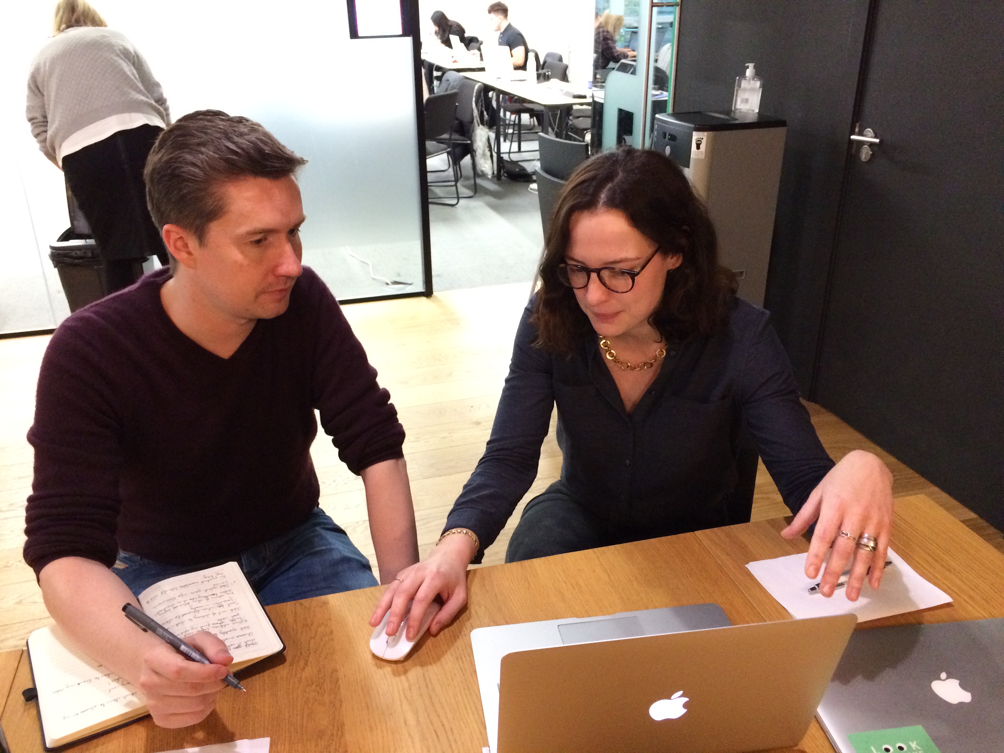

“Planning meals in advance is something I have trouble with. Also cooking for one can be a problem. Sometimes it’s just easier to pick up a ready meal on the way home. I would like to eat more healthy and varied meals though.”
SOLUTION
An app that Clara could use on the way home which would suggest recipes for her that are healthy and easy to cook. The app will suggest healthy recipes that can be cooked in under 30 minutes based on her dietary requirements and preferences. The app will suggest recipes for one or, if Clara chooses, for more people.
Throughout the user research and participatory process we agreed on three main problems that the app would need to solve:
1) The recipes suggested by the app would need to be easy to make in under thirty minutes. Clara would like to enjoy her evenings and wasn’t that keen on making complicated meals.
2) The recipes should be healthy with an option for more “comfort food” recipes if she wanted.
3) There should be a feature on the app to incorporate any ingredient that she knew she had at home - a ‘base’ ingredient.
INITIAL DESIGN ITERATIONS
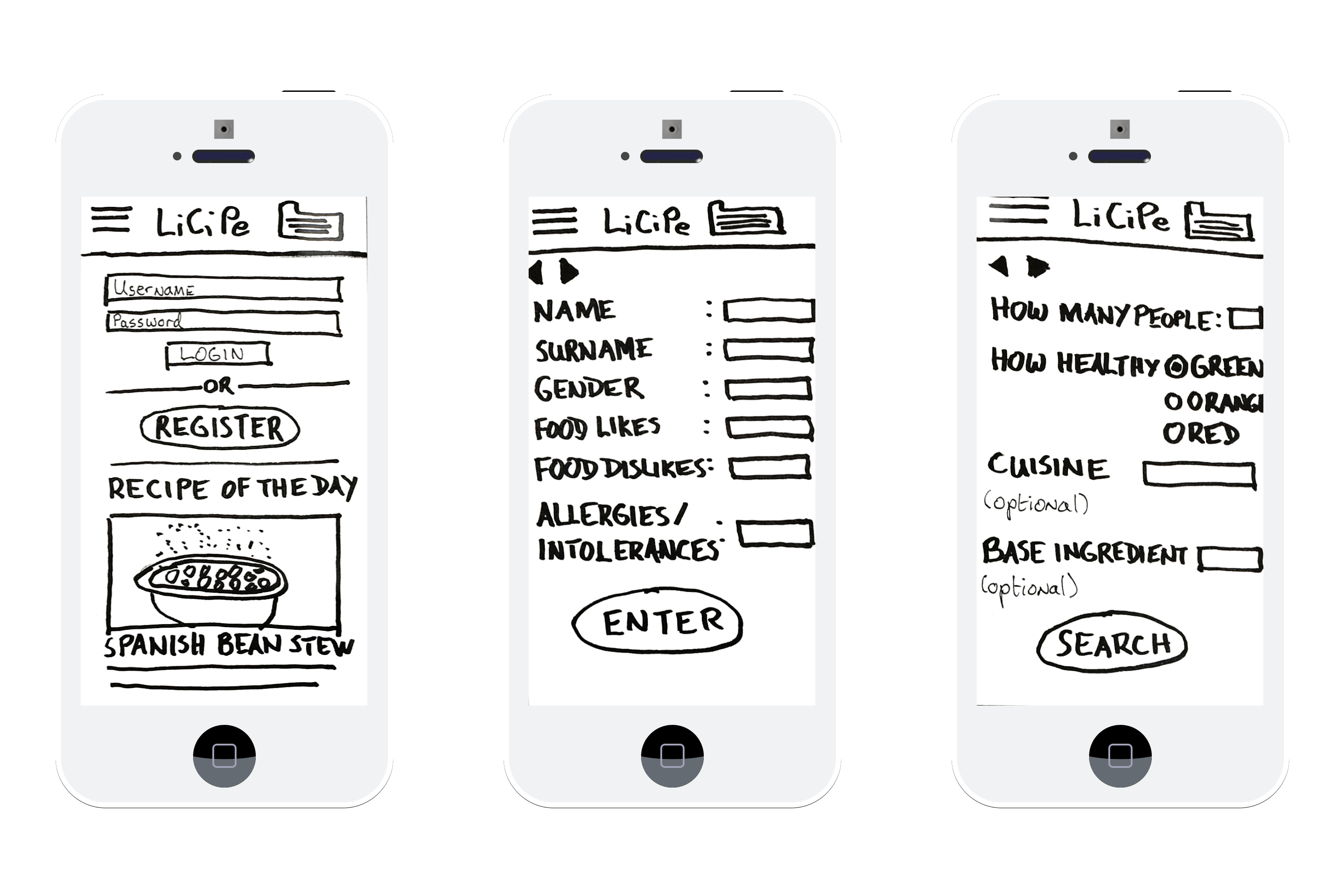
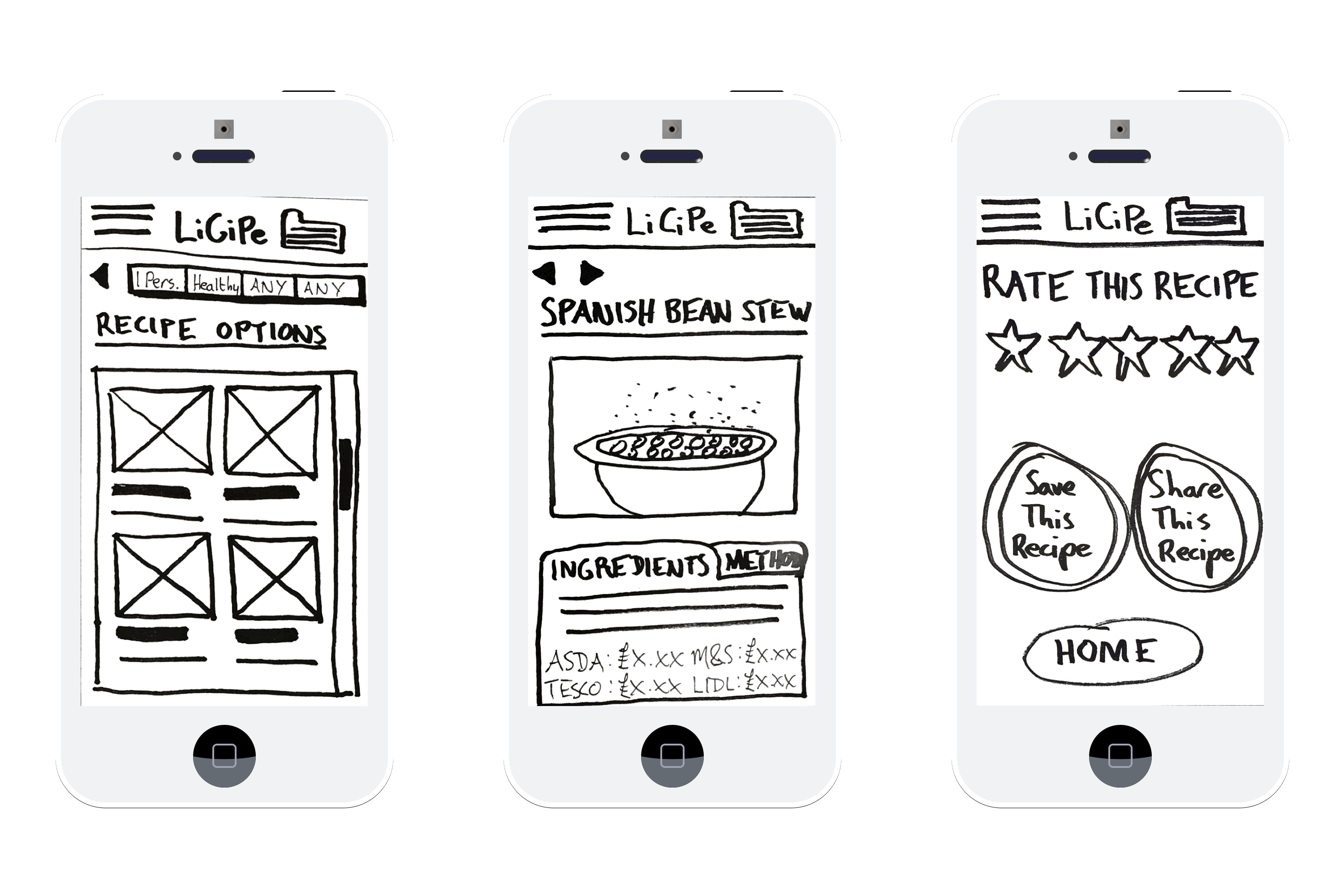
Various iterations were made of the initial designs based on user feedback from Clara and several other testers. The main changes made were :
1) The layout of the login and registration form fields was changed as the initial design was deemed to confusing by the users.
2) A recipe of the day feature was added to the home page. The user responded very positively to this feature even though it wasn’t requested but it was added to respond to user needs.
3) They type of cuisine and base ingredient form fields were made optional as the user said she would use them occasionally but not all the time.
4) The amount of recipes shown at one time on the screen were reduced to increase legibility.


BRANDING
From the initial research and feedback from the prototypes I established five key words associated with how licipe should be branded. Home-made, healthy, easy, simple, and fresh. With these key words in mind I redesigned the prototypes and started testing some assumptions about colour, style and typography. I simplified the look of the initial prototype and removed any unnecessary items. For example, I removed the preferences bar on the recipe browser following user feedback as there was no need to have a reminder of preferences entered in the previous screen.
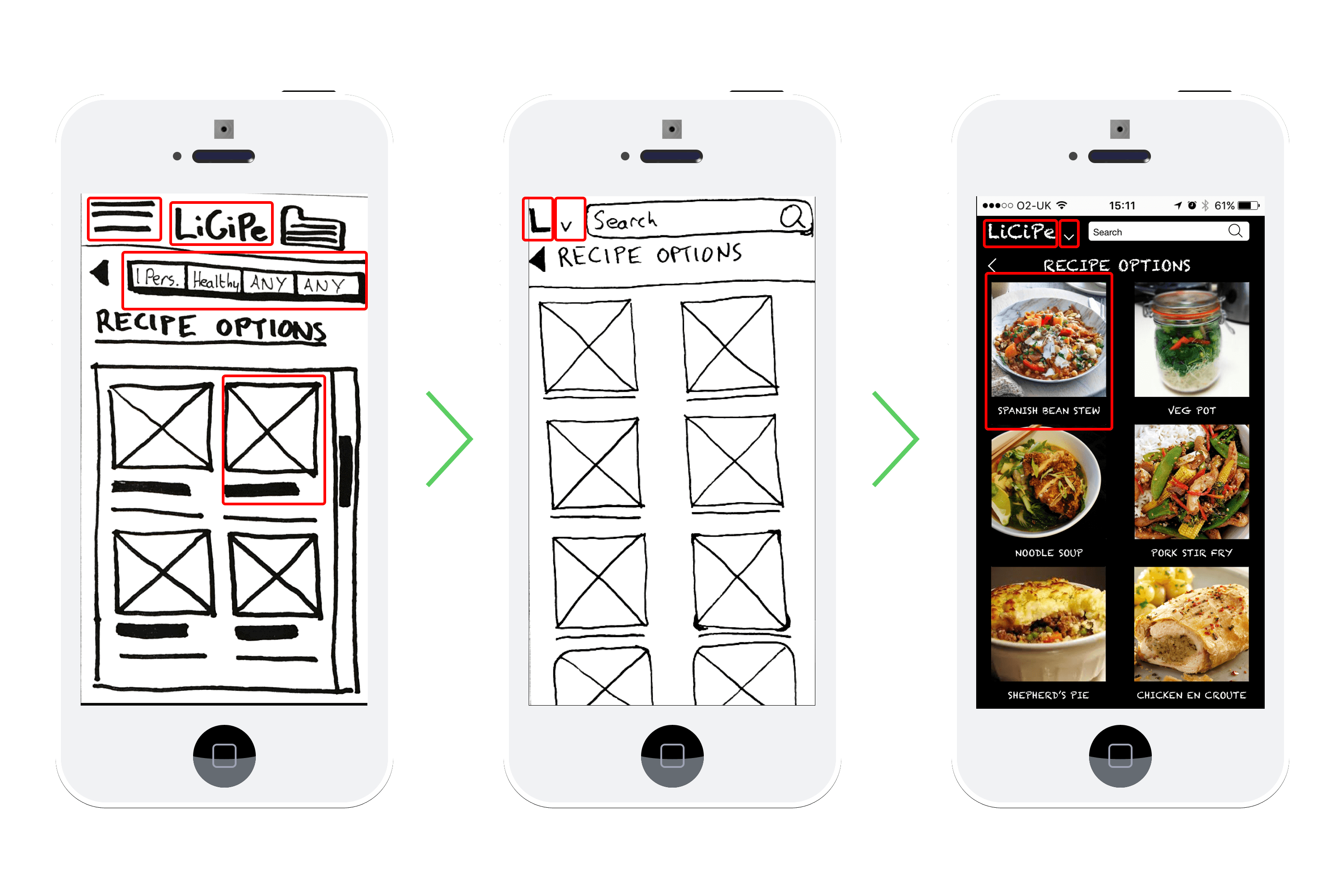

I considered the hierarchy of the features on the page. I made the photos more prominent by removing some of the text around the images and also making the images larger. I also looked at colour. My initial concept was to have the aesthetic of a chalkboard menu outside a pub or restaurant, with a black background and chalk-like typeface. While some users responded well to this look, it wasn’t really fitting with the licipe brand. I also looked at several variations of the logo which I’ll talk a bit more about later
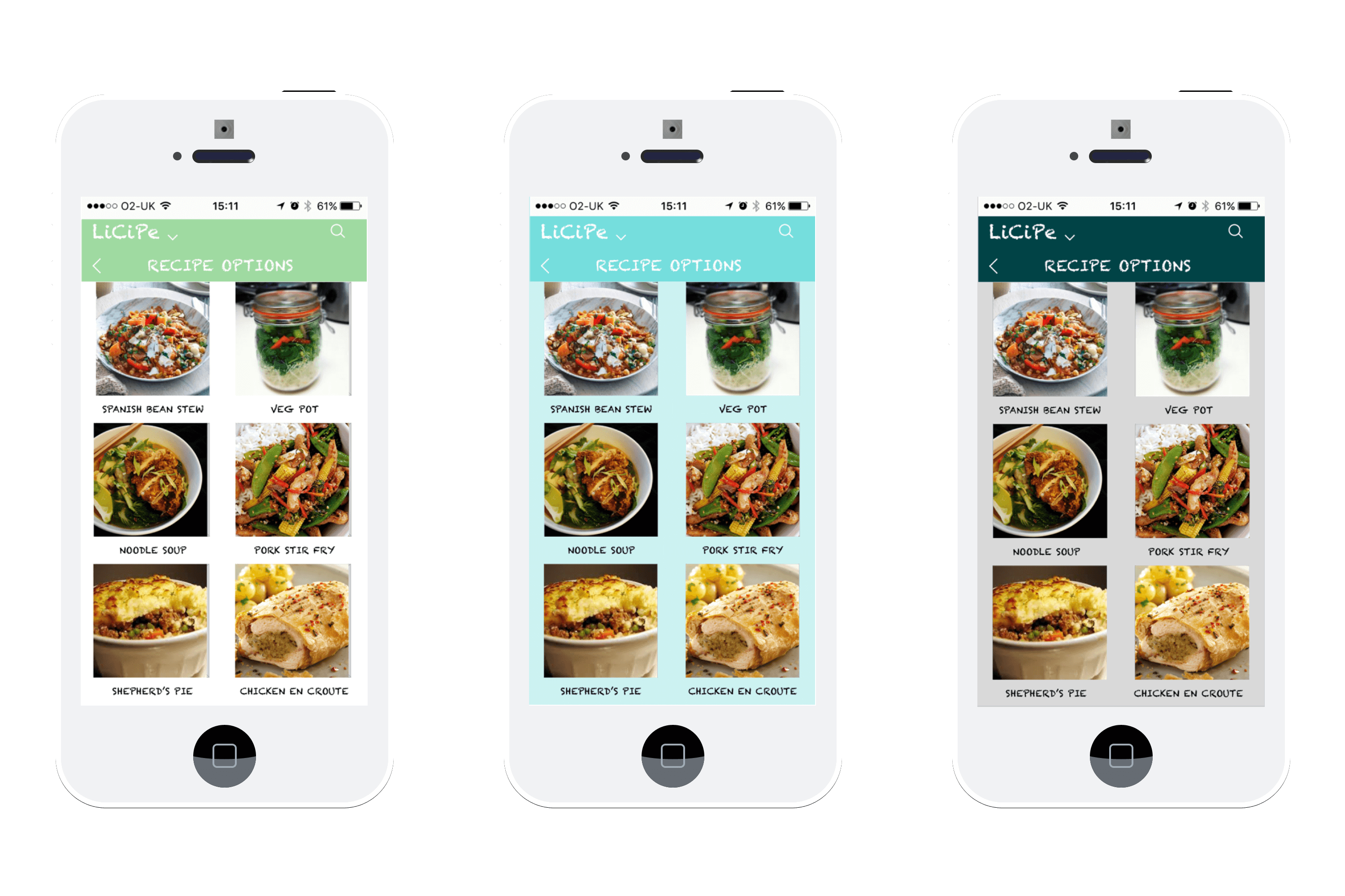

Thinking more about colour I decided to look at green as it is the colour associated with nature and with healthy, natural food. I experimented with several types of green to find out which one users preferred until I was able to define which hue would work best.
I designed several logos with varying degrees of success. The most favourable responses were from using the stencil typeface which is simple, easy to read, which fit with the branding for licipe.
These colours here are the ones that most people liked and which were used on the final screens. People reacted positively to these colours with comments like ‘clean’ and ‘fresh’. The typeface used for the icon was alert stencil and I kept it simple by using lucida grand for the rest of the text.
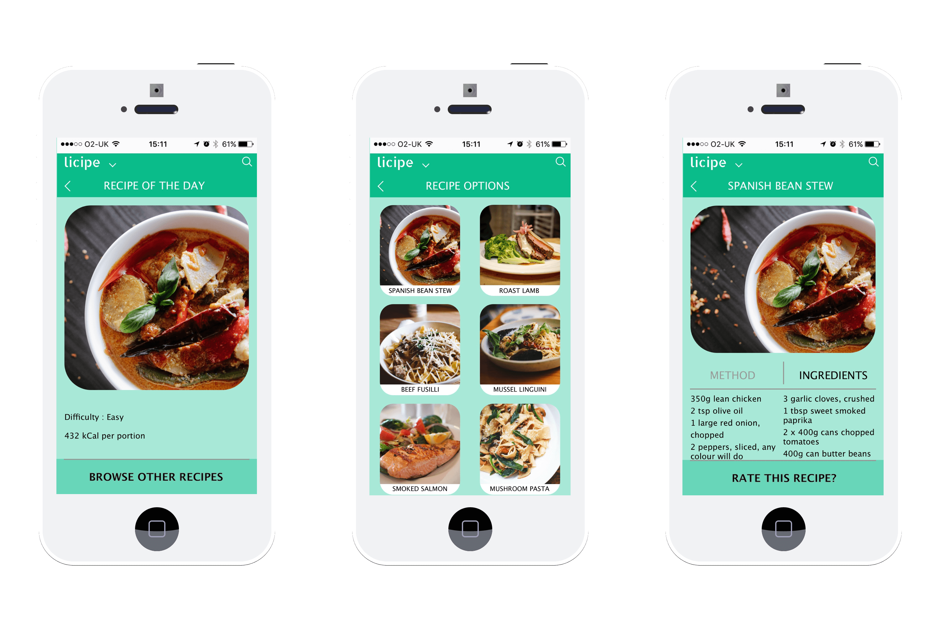
Some small changes were made after the final testing of the high-fidelity prototypes. Rounded edges were added to the images to give the app a friendlier feel. Colour was added to these areas to make it clearer that they were call to action buttons. Images on the recipe options page were made clearer. The search icon was moved closer to the edge of the page for a cleaner look. And finally, the body text was amended to make it easier for people to read.
OUTCOME
A clickable prototype in Invision which allows for the three main problems to be solved.

NEXT STEPS
Link with calendar to suggest meals on nights when no events are scheduled.
Party food planner for when she needs to make a lot of food when she’s invited friends over.
Meals based on seasonal produce sourced locally for financial and sustainability benefits.
