
BROKER COMPARE
Creating a better experience for investors looking for a broker.
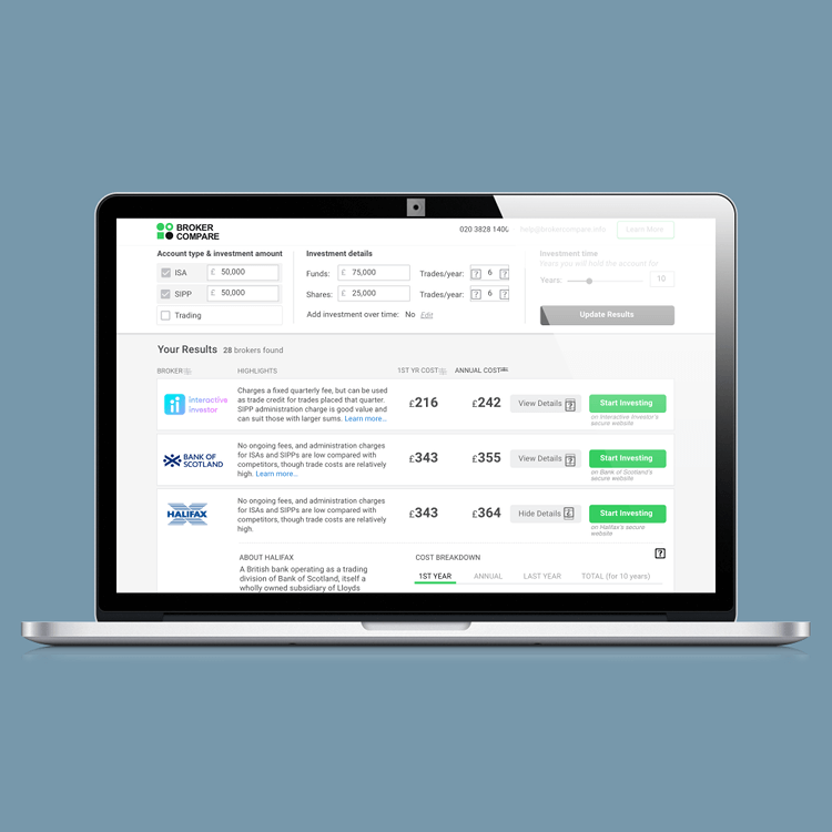
Broker Compare is a price comparison site specifically for investors looking to use execution only stockbrokers and platforms. The pricing of stockbroker services is very complicated; each broker charges a different combination of fees based on several factors, such as trade fees, platform costs and exit fees. This means that what might be the cheapest for one person might be the most expensive for another. Broker Compare helps investors find tailored results for broker fees based on their investment style. The Broker Compare tool has also been white labelled for Money to the Masses and This is Money.
THE BRIEF
We were tasked with improving the user journey from arriving at the Broker Compare tool to opening an account on a broker website. The aim was to make the process as seamless as possible for experienced investors. We also wanted to give people who are less confident enough information for them to gain an understanding of the process and go on to open an account.
Client | Broker Compare
Target Device | Desktop
Sprint Duration | 2.5 Weeks
Team Size | 3
Skills Used | User research, Concept mapping, Competitive Analysis, Contextual Analysis, Surveys, User flows, Sketching interfaces, Paper prototyping, Interviews, Jobs to be done, Task Analysis, Experience Maps, Usability testing, Presentation techniques
Software Used | Sketch, Trello, Invision, Adobe Photoshop, Keynote
RESEARCH
We met with people who invest money in ISAs, SIPPs and shares, who are the target users of the Broker Compare tool. These were intermediate and experienced level investors. We interviewed and observed them interacting with the current Broker Compare site.
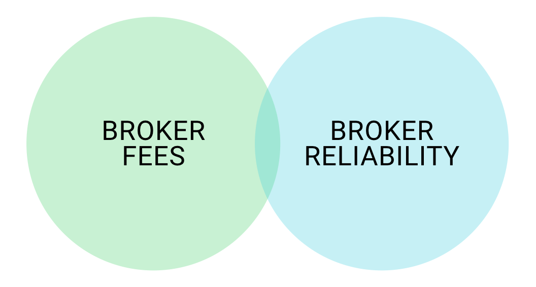
During the interviews we asked our participants what their main considerations and frustrations were when searching for an online broker. Although broker fees was often the a primary consideration, all the participants pointed out that broker reliability was one of the most important factors. Specifically, broker’s reputation, track record and if a broker name wasn’t familiar - people wanted to learn more about them before they would make a decision to invest. In fact, according to our research, people are willing to pay a bit higher fees, knowing that they are investing their money with a broker they can trust.

Financial jargon on the Broker Compare website often came up as a point of frustration for the investors we interviewed. While this seems to be an industry-wide problem, there was scope for improvement on the site.
Many interviewees were also unsure why they had to enter certain information in order to get a broker comparison result.
"Jargon is a frustration when looking for a broker. If I don’t understand, I won’t invest."
Iona Seligman
"I don’t know what trades per year is. If I’m doing this through a broker I would delegate these decisions."
Duncan Collins
COMPETITIVE ANALYSIS
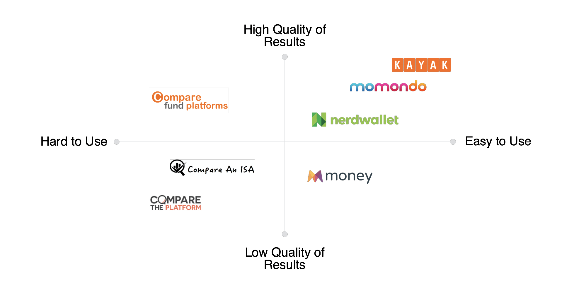
We observed how the investors interacted with competitor sites to see what they liked about those sites and what their frustration points were. In addition to this we evaluated the competitor sites based on ease of use and quality of results. Many of the direct competitors were not so easy to use and the comparison results they gave were not always tailored for the individual user. Some of the indirect competitors fared much better on the ease of use and quality of results and gave us a good indication of where the Broker Compare site could improve.

USER JOURNEY
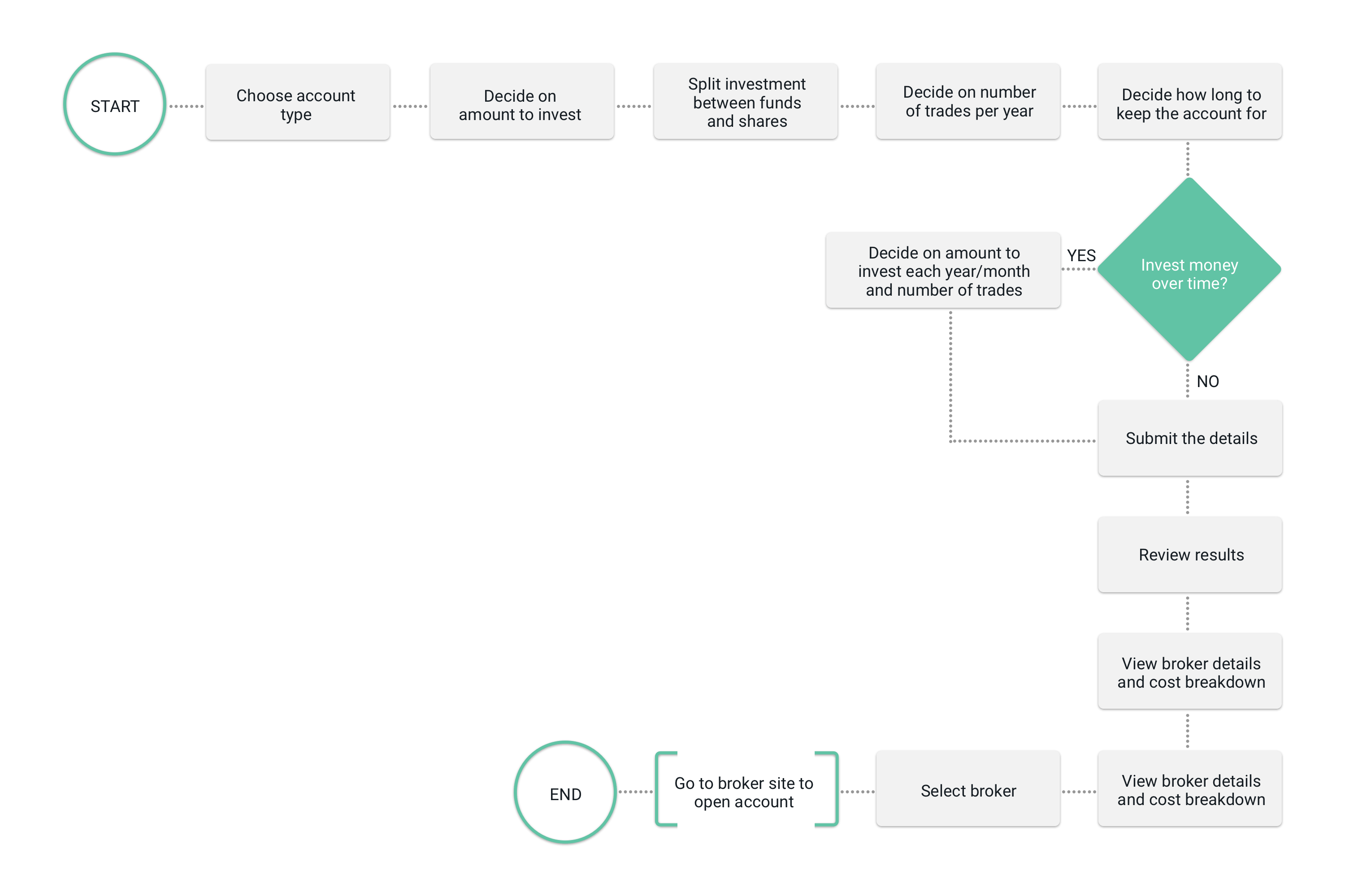
Once we had collated all of our findings from interviews and contextual inquiries we were presented with a wide range of opinions and some conflicting demands. With this in mind, creating personas would have limited value. Instead we focussed on the jobs that users needed to achieve using Broker Compare. Jobs to be done is a powerful tool as it focusses on the motivations and challenges the user faces, inspiring the designer to use empathy. The highest job to be achieved was : In order to maximize the return on investments, I need to find an online broker that best suits my investment needs. From this we were able to establish a user flow for an investor visiting the Broker Compare website.

EXPERIENCE MAP
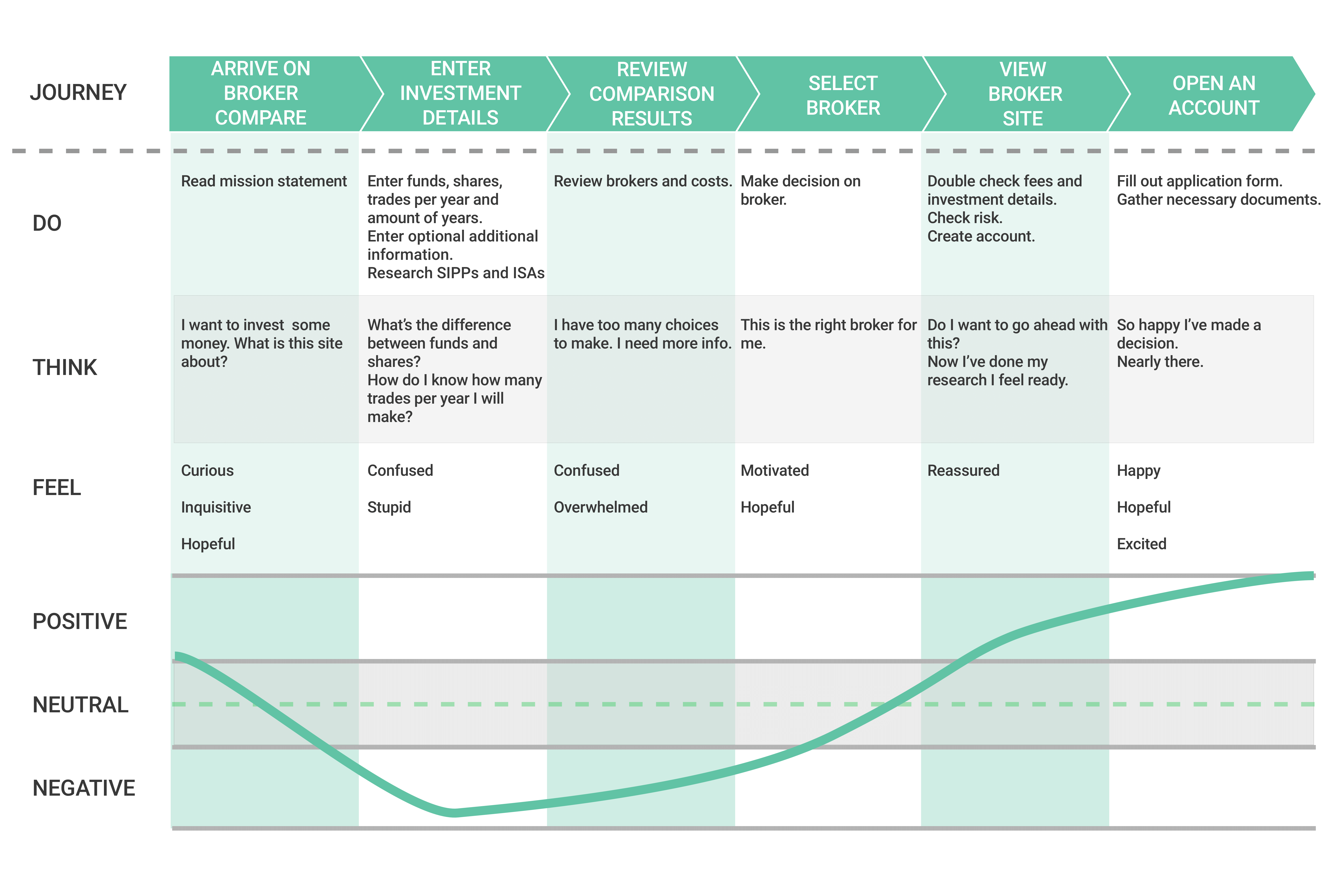
We considered the experience of investors using the Broker Compare tool and where any potential pain points might be in relation to the tasks they need to perform to reach their goal. The experience map below illustrates how investors might feel confused and anxious when filling out information on the existing Broker Compare website. We drew up this map based on the responses we received from our surveys and interviews.

PROBLEM STATEMENT
When using the Broker Compare tool, people do not receive enough information to make a confident decision about which investment broker will best suit their needs.
HYPOTHESIS
We believe that the Broker Compare website should provide a strong mission statement, clearer explanations of financial jargon, and more details about each broker, without having to go to each individual broker’s website. This will give investors a better understanding of the fees charged by each broker and give them the confidence to arrange an investment with the broker most suited to their needs.
DESIGN STUDIO
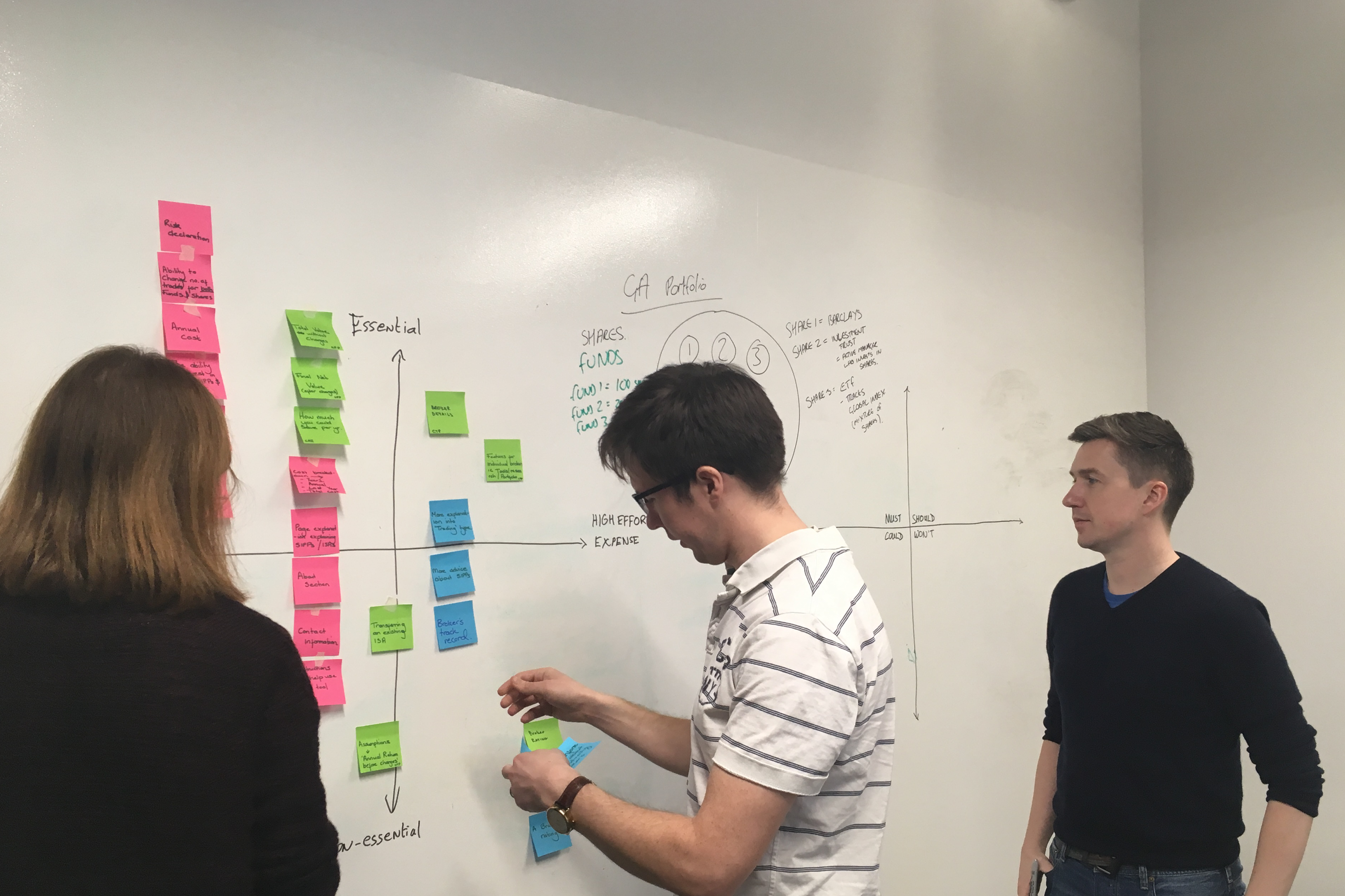
We conducted a design studio with the client to discuss the mission statement for the site and also feature prioritisation. Feedback from testing the existing site indicated that a clear statement of what Broker Compare does was needed. Together we established the mission statement that you will see on the first page of our prototype.
We also carried out a feature prioritisation exercise as we wanted the client's input into what would be possible at this stage based on time and budget considerations. This gave us a clear indication of the hierarchy of information and functionality for the Broker Compare tool.
We further ordered the features not existing on the site already into areas that must, could, should and won’t be featured on our prototype. This gave us a clear understanding of what to focus on now and what could be put in the roadmap for development in the future.

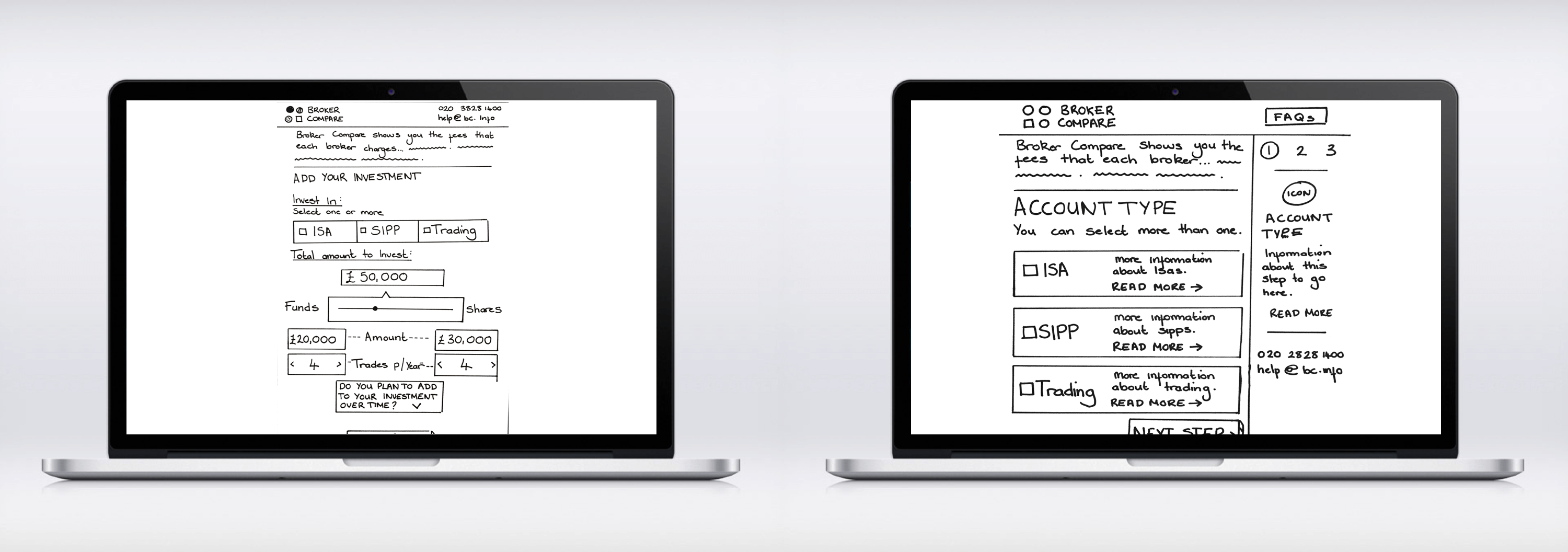
Armed with all our research, we started sketching paper prototypes. Initially we had 2 competing ideas : to keep the form on 1 page or to break it down into step-by-step sequence. After testing both ideas it became clear that the multi-step form was a favoured approach with users. In the multi-step form, there was room for adding explanations and additional information. One of the participants compared it to a tutorial that was teaching them about finance. They felt that someone was holding their hand as they walked through the form.

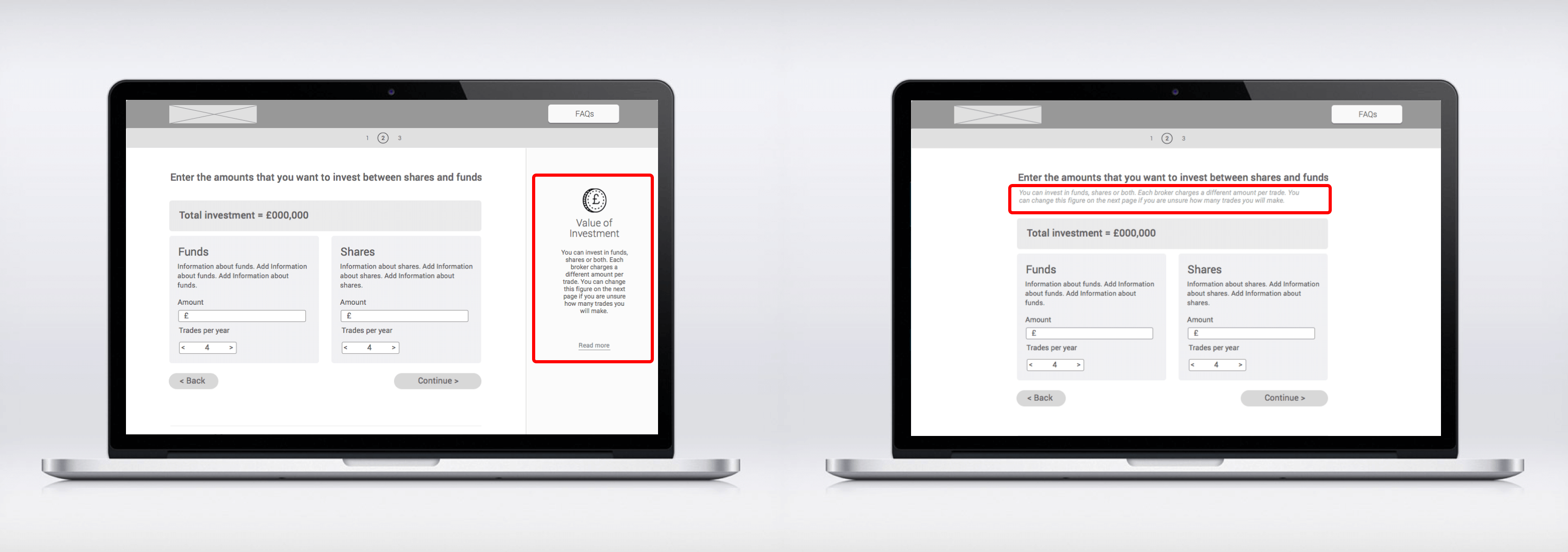
Initially we added the most important help text next to the fields and put the additional help text into a sidebar. However, during the testing we realised that people did not see sidebar at all, even when they were stuck on a question, they did not look to the right. They were too concentrated on the task at hand and focussed on the main area of the page. So we decided to take the additional help text, move it inside the form and get rid of the sidebar.

OUTCOME
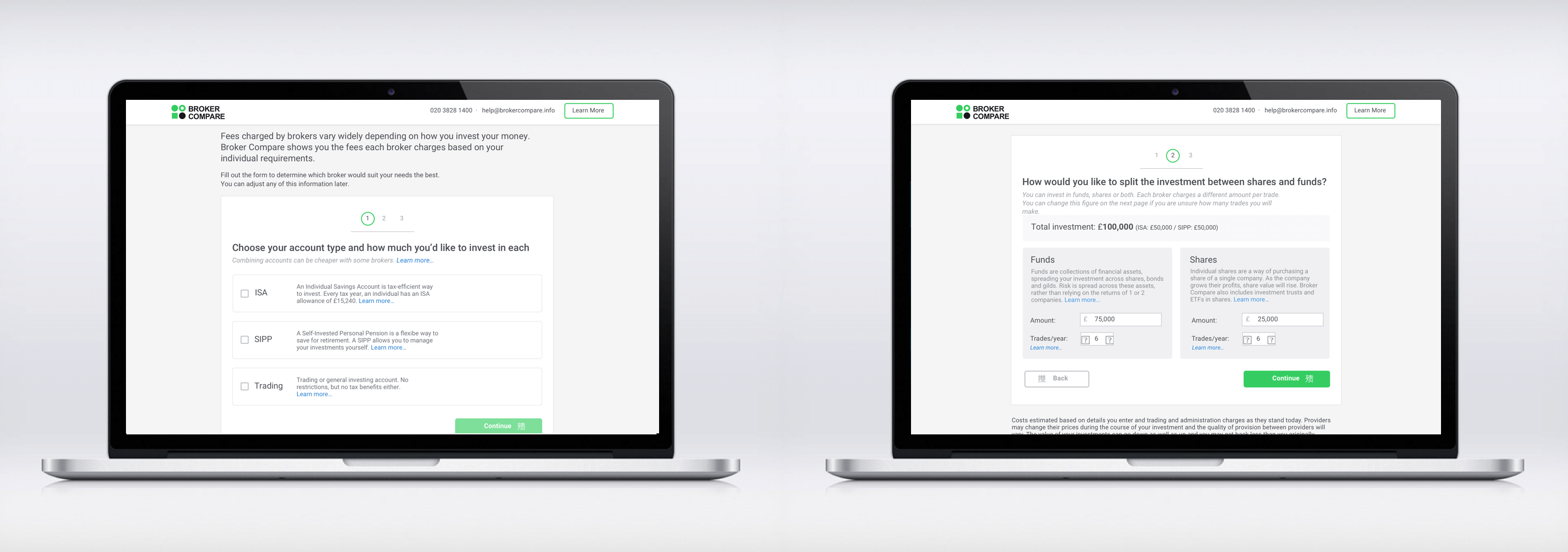
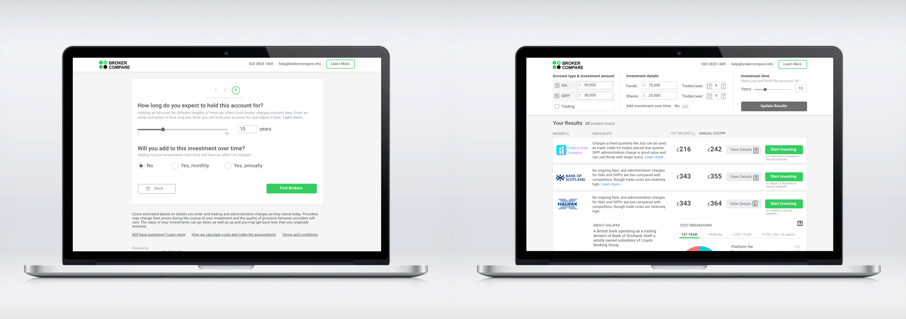
The outcome of all our work and research was a responsive website. The main wireframes for the site are illustrated below. The full version of the clickable Invision prototype, demonstrates how investors are clearly guided through the process to compare various quotes from brokers. Please click on "TRY THE PROTOTYPE" at the bottom of this page to see the full version.


NEXT STEPS
The prototype we presented is a final version which includes all the features and functionality that resulted from our research and testing. In terms of implementation this can be done in stages based on priority. We suggested the following strategy to Broker Compare :
Short term strategy
• Change existing help text (we have provided a glossary with the improved explanations)
• Add more details about broker
Long term strategy
• Build a step-by-step form
• Improve navigation
• Redesign the help section
In terms of next steps once these have been implemented, we could look at incorporating a feature to email search results to investors so that they can save them for later. This should help to improve conversion rates.
